Sunday, 26 March 2017

Wednesday, 22 March 2017
Magazine Advertisement Production
This is my Final Magazine Advertisement

My magazine advertisement features the four protagonists on white backgrounds arranged in a grid format as the main image. This links to the digipak and the music video as the characters appear on a plain white background during the dance section, and walk across the screen with black bars separating them in the walk section. At the top of the advertisement, under the RCA Records logo is the title of the album and the name of the band. This makes it impossible to mistake the advertisement for something else. Below the main image is a box containing reviews for the album so that people can judge whether or not they want to invest in it, and to the right of that is the band's social media information, so that people can follow them if they enjoy the album.
Monday, 20 March 2017
Digipak Production
This is my final digipak


Sunday, 5 March 2017
Magazine Advertisement Planning
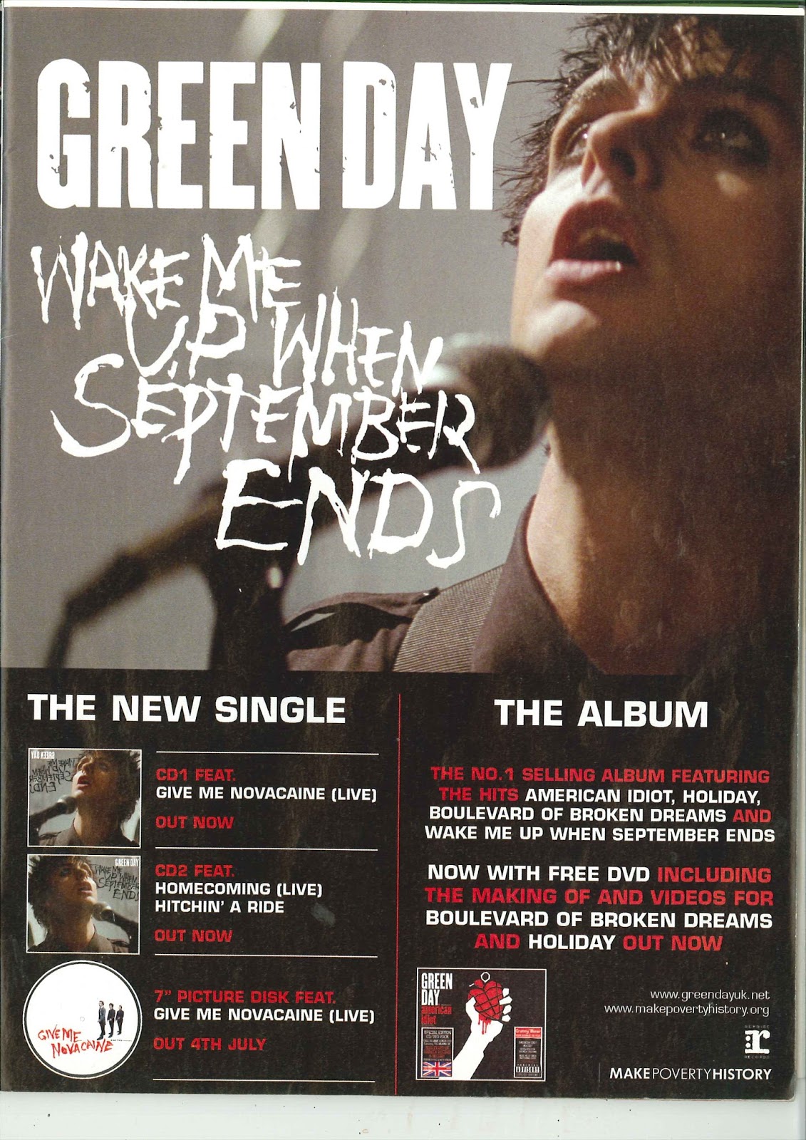
Magazine advertisements for music videos and albums come in different forms. Some are very simple (only containing information on where to buy the song/album), while others contain lots of info about what can be found on each disc, when the album will be released, and the names of the main songs.

 However, most advertisements feature a close-up of the artist as the main image, but some favour a more artistic approach such as these:




Monday, 27 February 2017
Digipak Planning
There are numerous types of Digipak, each with different numbers of panels and different places for discs (including sleeve pockets and disc trays)
4 Panel:
The four panel digipak has two panels on each side (inside and outside). One of the inside panels will contain the disc.
The four panel digipak has two panels on each side (inside and outside). One of the inside panels will contain the disc.

6 Panel:
The six panel digipak has three panels on each side. While the image below has two discs, this style of digipak works well with just one disc positioned in the center. The image below also shows that some digipaks can also have a sleeve.
The six panel digipak has three panels on each side. While the image below has two discs, this style of digipak works well with just one disc positioned in the center. The image below also shows that some digipaks can also have a sleeve.
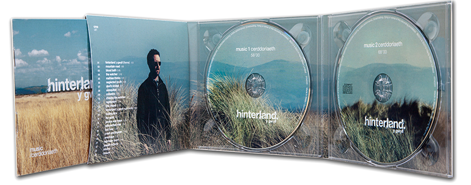
8 Panel:
The eight panel digipak has four panels on each side. This is better suited to albums with multiple discs as there is no central panel.
The eight panel digipak has four panels on each side. This is better suited to albums with multiple discs as there is no central panel.

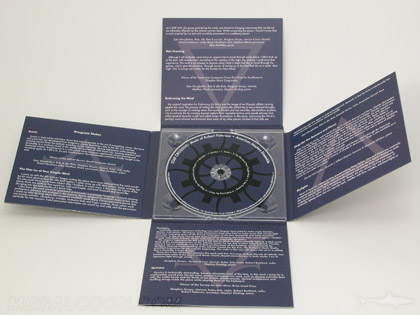
10 Panel:
The ten panel digipak has five panels on each side and can be arranged in a cross formation with a central disc.
The ten panel digipak has five panels on each side and can be arranged in a cross formation with a central disc.
I will be creating a six panel digipak as I feel as though there is the perfect amount of space for the disc, images, and a track list. Anything bigger than this will have too much free space and anything smaller will not have enough space.
Thursday, 26 January 2017
Cops and Robbers

This is the final version of our music video.

I made a few more changes in final cut to enhance the video even more:
- Changed the font in the Victorian section to something slightly less decayed.
- Added a muzzle flash when the gun is fired in the 1930s section.
- Changed the font transition for the Present Day section to "Typerwriter" (makes it look as though the title is being typed)
1930 begins at 1:30
1950 begins at 1:53
1970 begins at 2:26
Dance begins at 3:44
Walk begins at 4:06
Present Day begins at 4:15
Tuesday, 24 January 2017
Version 8 Changes
I have made numerous changes to the music video in post production to make it look more polished. The list of changes can be found below:



 Below is the full updated version:
1890s begins at 0:00
1930s begins at 1:30
1950s begins at 1:53
1970s begins at 2:26
Dance begins at 3:44
Walk begins at 4:06
Present Day begins at 4:15
1890:
- Added colour correction (adjusted "Combat" filter) to make the scene stand out and feel more cinematic.
- Added cinematic bars during the narrative part which slide out as the music begins.
- Added looped industrial sound effects during the narrative part as well as footstep sounds when 'Cop' is walking.

1930:
- Added colour correction (adjusted "Sepia" filter) to make the scene stand out and feel more cinematic.
- Changed gunshot sound effect to something more powerful.

1950:
- Added colour correction (increased saturation of midtones and reduced exposure of midtones) to make the scene stand out and appear more vibrant.

1970:
- No changes made as the default colour suits this section.

Green Screen:
- Replaced some dance moves with better/higher quality versions.

Present Day:
- Changed font to something more associated with technology and the modern day.
- Added UK Emergency Services Police siren in the background (modified with "Spaceship" audio effect to distort and "Large Room" audio effect to echo, making the sound appear distant)

1930s begins at 1:30
1950s begins at 1:53
1970s begins at 2:26
Dance begins at 3:44
Walk begins at 4:06
Present Day begins at 4:15
Subscribe to:
Posts (Atom)