
Thursday, 27 April 2017
Final Post
I have now finished all production of my music video as well as the magazine advertisement and digipak. From the entire process from planning to evaluation, my production and post production skills have improved significantly, helping prepare me for future productions.
Thursday, 20 April 2017
Evaluation: Technologies and Editing Breakdown
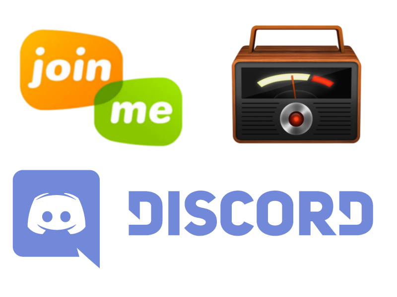
Ollie and I went through the entire filming and editing process on Final Cut Pro, looking in depth at the various camera angles and editing techniques. We used Join Me to share the screen and Piezo to record our voices while we spoke over Discord. My audio is outputted in the left ear and Ollie's in the right when wearing earphones or headphones.
As well as simply recording the screen, the first 30 seconds are animated. This was achieved through the use of Photoshop to draw a background as well as cartoon version of ourselves with different facial expressions including "eyes open, mouth open", "eyes open, mouth closed", "eyes closed, mouth open", and "eyes closed, mouth closed", then alternating between the appropriate images as we spoke using Final Cut Pro.
Saturday, 15 April 2017
Evaluation: Audience Feedback
I have now recieved feedback on my music video and ancillery tasks.


Most of the people who viewed my music video and ancillary tasks were male and between 11 and 20 years of age.


Monday, 10 April 2017
Evaluation: Ancillary and Main Production
How effective is the combination of your main product and ancillary tasks?
My main music video links very well with my digipak and magazine advertisement as they all share the split screen effect on the plain white background that appears at the end of the music video.


The brick background on the front and back covers of the digipak conforms more to the Rock genre, while the four characters on the white background on the magazine advertisement has more in common with Pop music advertisements. This emphasises that my music video uses conventions of both genres as it is a hybrid.
Wednesday, 5 April 2017
Sunday, 26 March 2017
Wednesday, 22 March 2017
Magazine Advertisement Production
This is my Final Magazine Advertisement

My magazine advertisement features the four protagonists on white backgrounds arranged in a grid format as the main image. This links to the digipak and the music video as the characters appear on a plain white background during the dance section, and walk across the screen with black bars separating them in the walk section. At the top of the advertisement, under the RCA Records logo is the title of the album and the name of the band. This makes it impossible to mistake the advertisement for something else. Below the main image is a box containing reviews for the album so that people can judge whether or not they want to invest in it, and to the right of that is the band's social media information, so that people can follow them if they enjoy the album.
Subscribe to:
Comments (Atom)